
Are you tired of boring and outdated login pages? Look no further! In this post, we will explore the world of modern and creative front-end login pages that will make your website stand out.
First and foremost, a modern login page should be user-friendly and easy to navigate. This means having a clear and concise message, as well as a simple and intuitive layout. Users should be able to easily find where to enter their login credentials and any relevant information they need.
In terms of design, a modern login page should be visually appealing and attention-grabbing. This can be achieved through the use of bold typography, vibrant colors, and engaging imagery. However, it’s important to strike a balance between creativity and functionality. While a visually stunning login page can be impressive, it’s essential to ensure that it doesn’t detract from the user’s ability to log in and access your website.
Another important aspect of a modern login page is responsiveness. With the increasing number of users accessing websites on mobile devices, it’s crucial to ensure that your login page is optimized for both desktop and mobile devices. This means using responsive design techniques to ensure that the login page adapts to different screen sizes and resolutions.
In conclusion, a modern and creative front-end login page can make a positive impression on users and set your website apart from the competition. By focusing on user-friendliness, visually appealing design, and responsiveness, you can create a login page that not only looks great but also functions seamlessly.
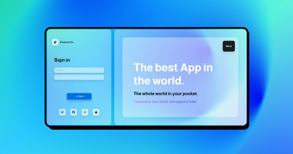
If you’re looking for inspiration, you are in the right place, check out the code below for a creative and modern front-end login page design.
You can download the files and images from here and continue the post 😉
The HTML Code:
Celestial | Log in Finance Co.
The best App in the world.
The whole world in your pocket.
"Streamline Your World, One App at a Time"
The CSS Code:
@font-face {
  font-family: MarkaziText-Bold;
  src: url(../fonts/MarkaziText-Bold.ttf);
}

@font-face {
  font-family: MarkaziText-Regular;
  src: url(../fonts/MarkaziText-Regular.ttf);
}


@font-face {

  src: url("../fonts/Almarai-Bold.ttf");
  font-family: "Almarai-Bold";
}

@font-face {

  src: url("../fonts/Almarai-ExtraBold.ttf");
  font-family: "Almarai-ExtraBold";
}

@font-face {

  src: url("../fonts/Almarai-Light.ttf");
  font-family: "Almarai-Light";
}

@font-face {

  src: url("../fonts/Almarai-Regular.ttf");
  font-family: "Almarai-Regular";
}


/* Responsive  */
/* ===============================================  */

@media screen and (max-width: 992px) {


  .art-section {
    display: none;
    height: 100vh !important;
  }

  .login-form {
    padding: 0 !important;
  }

  .signin-alternative {

    justify-content: space-between !important;
  }

  .twitter-btn,
  .facebook-btn,
  .google-btn,
  .apple-btn {

    width: 20% !important;

  }

  .login-logo {
    padding-left: 1.5rem;
  }

  .login-logo img {

    padding: .5rem !important;
    border-radius: .8rem !important;
  }
}

/* Responsive  */
/* ===============================================  */


:root {

  --art-text-color: #ffffffcd;


  --dark-color: hsl(var(--hue), 100%, 9%);
  --light-color: hsl(var(--hue), 95%, 98%);
  --base: hsl(var(--hue), 95%, 50%);
  --complimentary1: hsl(var(--hue-complimentary1), 95%, 50%);
  --complimentary2: hsl(var(--hue-complimentary2), 95%, 50%);

  --font-family: "Poppins", system-ui;

  --bg-gradient: linear-gradient(to bottom,
      hsl(var(--hue), 95%, 99%),
      hsl(var(--hue), 95%, 84%));

}


html {

  height: -webkit-fill-available;
}


body {

  font-family: "Almarai-Bold";
  width: 100vw;
  height: 100vh;
  min-height: -webkit-fill-available;
  min-height: 100vh;
  background: linear-gradient(-45deg, #9eb5ff, #78ffd2, #3dcbff, #23d5ab);

}


/* =================== */
/* login START */
/* =================== */

.orb-canvas {

  position: fixed;
  top: 0;
  left: 0;
  width: 100%;
  height: 100%;
  pointer-events: none;
  z-index: -1;
}

.container-mine {
  height: 100%;
  width: 100%;
  background-size: 2800px;
  object-fit: cover;
  display: flex;

}

.login-section {


  height: 100vh;
  padding: 1rem;


}

.login-container {

  height: 100%;
  border-radius: 2rem;
  backdrop-filter: blur(7.6px);
  -webkit-backdrop-filter: blur(7.6px);
  border: 1.5px solid #ffffff88;
  background: rgba(255, 255, 255, 0.375);
  box-shadow: 0 0.75rem 2rem 0 rgb(0 0 0 / 10%);

}


.login-logo {
  height: 7%;
  width: 100%;
  display: flex;
  align-content: center;
  justify-content: flex-start;
  align-items: center;

}


.login-logo span {

  margin-left: 1rem;
  font-size: 1.5rem;
  font-family: "Almarai-ExtraBold";


}


.login-logo img {
  height: 100%;
  padding: 1rem;
  min-width: 50px;
  min-height: 50px;
  border-radius: 1.2rem;
  backdrop-filter: blur(7.6px);
  -webkit-backdrop-filter: blur(7.6px);
  border: 1.5px solid #ffffff88;
  background: rgba(255, 255, 255, 0.375);
  box-shadow: 0 0.75rem 2rem 0 rgb(0 0 0 / 10%);


}


.login-form {
  width: 100%;
  height: 100%;
  padding: 0 3rem;
  display: flex;
  justify-content: space-evenly;
  flex-direction: column;
  flex-wrap: nowrap;
}

.login-form h3 {

  font-family: "Almarai-ExtraBold";
  font-size: 3rem;

}

.p-4 span {

  font-size: 1.9rem;
  color: #000000;
  font-family: "Almarai-Bold";


}

.input-email {
  margin-top: 3rem;
}

.input-email,
.input-password {

  display: flex;
}

.form-control-mine {
  direction: ltr;
  line-height: 2.5;
  border-radius: 1rem;
  transition: .5s;
  backdrop-filter: blur(7.6px);
  -webkit-backdrop-filter: blur(7.6px);
  border: 1.5px solid #ffffff88;
  background: #ffffff29;
  box-shadow: 0 0.75rem 2rem 0 #0000001a;
  padding-left: 5%;
}

.form-control-mine:focus {

  background-color: transparent;
  box-shadow: none;
  border: 1.5px solid #ffffff88;
}

.form-control-mine:focus::placeholder {
  color: transparent;
  transition: .5s;


}

.form-control-mine::placeholder {
  color: #00000044;
  transition: .5s;
  font-size: .8rem;

}

.form-switch {
  display: flex;
  flex-direction: row-reverse;
  justify-content: space-between;
  padding: 0rem 1rem;

}

.login-logo:hover .email-icon {

  display: block;
}


.email-icon,
.password-icon {

  width: 20%;
  padding: .5rem;
  height: 100%;
  position: absolute;
  left: 0rem;
  border-radius: 1rem 0 0 1rem;
  backdrop-filter: blur(7.6px);
  -webkit-backdrop-filter: blur(7.6px);
  border: 1px solid #ffffff88;
  background: #ffffff69;
  z-index: 1;

  display: flex;
  flex-wrap: nowrap;
  justify-content: center;
  align-items: center;

}

.email-icon::before,
.password-icon::before {
  color: #5f5f5f;

}


/* login button  */

.form-check-input-mine:focus {

  border-color: transparent !important;
  box-shadow: none !important;
}

.btn-container {
  width: 100%;
  height: 7%;
  padding: 0 1.5rem;
  justify-content: center;
  display: flex;


}


button {
  outline: 0;
}

button.active {
  outline: 0;
}

button.send {
  border: 0px;
  color: white;
  border-radius: 15px;

  background-color: #0071e3;
  position: relative;
  overflow: hidden;
  width: 50%;
  height: 100%;
  transition: all 0.3s ease 0s;
  box-shadow: 0px 20px 20px 0px #0071e357;


}


button.send .text {
  display: flex;
  align-content: center;
  justify-content: center;
  align-items: center;
  height: 100%;
}


button.send .text.active {
  transform: translateY(-350%) scale(0);
  transition: 0.35s cubic-bezier(0.34, -0.61, 1, 0.64);
}

button.send.active {

  width: 50%;
  align-self: center;
  box-shadow: none;
  transition: 0.4s cubic-bezier(0.35, -0.77, 0.67, 1.88);
}

button.send .loader {
  position: absolute;
  width: calc(0% - 4px);
  height: calc(100% - 4px);
  background-color: #fff;
  left: 2px;
  top: 2px;
  border-radius: 13px;
}

button.send .loader.active {
  width: calc(100% - 4px);
  transition: 1.3s ease-in-out;
  transition-delay: 0.5s;
}

button.send .done {
  color: #4e98d2;
  margin-right: 0px;
  height: 100%;

  transform: translate(-100%, -100%);
}

button.send .done.active {
  transform: translate(0%, -100%) scale(1);
  transition: .7s;
}


button.send.finished {

  transition: 0.4s cubic-bezier(0.35, -0.77, 0.67, 1.88);
  width: 20%;
}


.signin-alternative {

  width: 100%;
  height: 7%;
  padding: 0 1.5rem;
  display: flex;
  justify-content: space-evenly;

}

.twitter-btn,
.facebook-btn,
.google-btn,
.apple-btn {
  width: 13%;
  height: 100%;
  border: 0;
  background-color: transparent;
  border-radius: 15px;
  box-shadow: 0 0.75rem 2rem 0 rgb(0 0 0 / 10%);
  backdrop-filter: blur(7.6px);
  border: 1.5px solid #ffffff88;
  background: rgba(255, 255, 255, 0.375);
}


/* =================== */
/* login END */
/* =================== */


/* =================== */
/* ART START */
/* =================== */

.art-section {
  height: 100vh;
  padding: 1rem;
}


.art-container {


  height: 100%;
  width: 100%;
  display: flex;
  flex-direction: column;
  flex-wrap: nowrap;
  justify-content: space-between;

}


.art-box {

  height: 100%;
  width: 100%;
  padding: 5rem;
  color: white;
  backdrop-filter: blur(7.6px);
  -webkit-backdrop-filter: blur(7.6px);
  background: #ffffff60;
  box-shadow: 0 0.75rem 2rem 0 #0000001a;
  border-radius: 2rem;
  border: 1.5px solid #ffffff88;


}

.art-box span {

  height: 2px;
  width: 10%;
  background-color: #c1c1c1;
  border-radius: 5rem;
  display: inline-block;
  margin-bottom: 2rem;


}

.bg-inside-art {
  height: 100%;
  width: 100%;
  backdrop-filter: blur(7.6px);
  -webkit-backdrop-filter: blur(7.6px);
  background: #ffffff00;
  border: 1.5px solid #ffffff88;
  border-radius: 2rem;
  padding: 2rem;
}

.branding-art {
  height: 15%;
  display: flex;
  justify-content: flex-end;
  background-color: transparent;
  border: transparent;


}

.branding-art button {
  height: 100%;
  color: white;
  font-family: "Almarai-ExtraBold";
  backdrop-filter: blur(7.6px);
  padding: 0rem 2rem;
  border: 1.5px solid rgba(255, 255, 255, 0.533);
  background: #000000dc;
  box-shadow: rgb(0 0 0 / 10%) 0px 0.75rem 2rem 0px;
  display: flex;
  align-items: center;
  border-radius: 1.2rem;
  font-size: 1rem;


}

.art-text {

  height: 85%;
  width: 100%;
  padding: 5rem;
      display: flex;
        flex-direction: column;
        justify-content: space-around;

}

.art-text h1 {

  font-size: 7rem;
}

.art-text h3 {

  font-size: 2.8rem;
  color: black;
  font-family: "Almarai-Bold";
}

.art-text h5 {

  font-size: 2rem;
  font-family: "Almarai-Bold";
  background-image: linear-gradient(90deg, #ff5cf6 0%,  #3565e4 70%);
  background-size: 100%;
  -webkit-text-fill-color: transparent;
  -webkit-background-clip: text;
  -moz-background-clip: text;
  -moz-text-fill-color: transparent;

}


.art-box h4 {

  width: fit-content;
  font-size: 25px;
  margin-bottom: 2rem;

  font-family: "Almarai-ExtraBold";


}


.art-footer {

  height: 10%;
  width: 100%;
  background: #0000003d;
  border-radius: 1.5rem;
  backdrop-filter: blur(18.7px);
  -webkit-backdrop-filter: blur(18.7px);
  border: 1px solid #bababa43;
  display: flex;
  flex-wrap: nowrap;
  align-content: center;
  align-items: center;
  justify-content: center;
  border: 1.5px solid #ffffff88;
  backdrop-filter: blur(7.6px);
  -webkit-backdrop-filter: blur(7.6px);
  background: #ffffff60;
  box-shadow: 0 0.75rem 2rem 0 #0000001a;

}

.CR-footer {
  height: 80%;
  display: flex;
  flex-wrap: nowrap;
  flex-direction: row;
  align-content: stretch;
  align-items: center;

}

.CR-footer h1 {
  font-family: "Almarai-Regular";
  font-size: 1rem;
  margin-right: 1rem;
  margin-bottom: 0px;
  color: #ffffff;

}

.CR-footer img {
  height: 100%;
  padding: .5rem;
  border-radius: .8rem;


}

.carousel-mine {
  height: 100%;
}

.carousel-indicators {
  left: 0px;
  margin-left: 2rem;
  justify-content: flex-end;
  margin-bottom: 2rem;
}


/* =================== */
/* ART END */
/* =================== */
The CSS for Orb Background:
@import url("https://fonts.googleapis.com/css?family=Libre+Franklin:400,700&subset=latin");
body {

  display: flex;
}


.glass-cover{
  position:fixed;
  backdrop-filter: blur(55px);
  z-index:0;
  top: 0;
  bottom: 0;
  left: 0;
  right: 0;
}


.blobs{
  position:absolute;
  top:0;
  left:0;
  bottom:0;
  right:0;
  background:#88bac7;
  margin:auto;
  filter:blur(90px) contrast(2);
  animation:demonstration 10s linear infinite;
  overflow: hidden;

}


.blob{
  background:#9cdce7;
  position:absolute;
  right:75%;
  top:50%;
  margin-top:-100px;
  margin-left:-100px;
  border-radius:100%;
  /* transition: 2s; */
}

.big-blob{
    width: 150vw;
    height: 150vw;
    right: -50vw;
    bottom: 0vw;
    opacity: 0.6;
    filter:blur(10vw) contrast(1);
    background: #4860e9;
}

@keyframes blob-anim-1{
  0%{
    transform:translate(5vw, -7vw);
  }
  50%{
     transform:translate(6vw, 2vw);
  }
  100%{
    transform:translate(-3vw, 5vw);
  }
}
.blob:nth-child(2){
  animation:blob-anim-2 ease-in-out 2s infinite alternate;
  width:10vw;
  height:8vw;
}

@keyframes blob-anim-2{
  0%{
    transform:translate(3vw, 7vw);
  }
  50%{
     transform:translate(-6vw, 4vw);
  }
  100%{
    transform:translate(3vw, -5vw);
  }
}
.blob:nth-child(2){
  animation:blob-anim-2 ease-in-out 2s infinite alternate;
  width:15vw;
  height:11vw;
  background: #4e98d2;
}

@keyframes blob-anim-3{
  0%{
    transform:translate(-15vw, -10vw);
    opacity: 0.5;
  }
  50%{
     transform:translate(5vw, -3vw);
     opacity: 1;
  }
  100%{
    transform:translate(-7vw, 6vw);
    opacity: 0.8;
  }
}
.blob:nth-child(3){
  animation:blob-anim-3 ease-in-out 2s infinite alternate;
  background: #88bde9;
  width: 23vw;
  height: 22vw;

}
@keyframes blob-anim-4{
  0%{
    transform:translateX(5vw);
    width: 25vw;
  height: 28vw;
  }
  100%{
    transform:translatey(5vw);
  }
}
.blob:nth-child(4){
  animation:blob-anim-4 ease-in-out 2s infinite alternate;
  background: #ababf0;
  width: 24vw;
  height:18vw;
}
@keyframes blob-anim-5{
  0%{
    transform:translate(18vw, 4vw);
  }
  25%{
    transform:translate(11vw, -4vw);
  }
  50%{
    transform:translate(2vw, 1vw);
  }
  100%{
    transform:translate(-5vw, 4vw);
  }
}
.blob:nth-child(5){
  animation:blob-anim-5 ease-in-out 6s infinite alternate;
  width: 35vw;
  height: 25vw;
}
@keyframes blob-anim-6{
  0%{
    transform:translate(27vw, 11vw);
    width: 50vw;
    height: 40vw;
  }
  25%{
    transform:translate(7vw, -12vw);
  }
  50%{
    transform:translate(9vw, 7vw);
  }
  100%{
    transform:translate(-4vw, 11vw);
  }
}
.blob:nth-child(6){
  animation:blob-anim-6 ease-in-out 8s infinite alternate;
  width: 35vw;
  height: 25vw;
}


svg {
  position: fixed;
  top: 0;
  left: 0;
  width: 100%;
  height: 100%;
}
The JS Code:
$(".send").on('click', function(){
	$(".text").addClass("active");
	$(".send").addClass("active");
	$(".loader").addClass("active");
	$(".send").delay(1700).queue(function(){
        $(this).addClass("finished").clearQueue();
    });

	$(".done").delay(1600).queue(function(){
        $(this).addClass("active").clearQueue();
    });
})
Also, you can see the code on CodePen.io
If I helped you, please don’t forget to give me your opinion and follow me on social media❤️, Peace✌️
Comments